This list is by no means comprehensive, but here are 5 inspiring and useful elements for non profit web design:
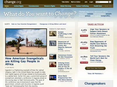
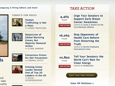
1. Change.org | Call to action with action counter
Change.org has a beautiful website, but look at this brilliant call to action on the right sidebar. Not only are you able to see the petitions, but there is a counter to tell how many people have signed a particular petition. Nothing like a little peer motivation to get someone to sign up.
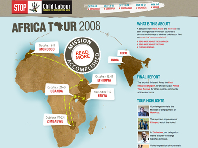
2. Stopchildlabour.eu | Break the mold with a daring layout
The Africa Tour page of stopchildlabour.eu takes a new approach to website layout, this bold graphic makes a big statement for this non profit.
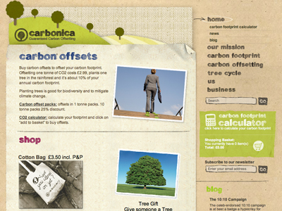
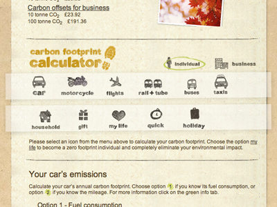
3. Carbonica.org | Carbon footprint calculator
Adding the carbon footprint calculator is a brilliant move by Carbonica, it serves to inform users about their footprint, and it keeps them interested in the site.
4. Travelingguys.com | Really, really beautiful photographs
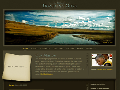
It's very rare to find great photography on a website, the beautiful scenery The Traveling Guys' website makes this website stand out in a crowd.
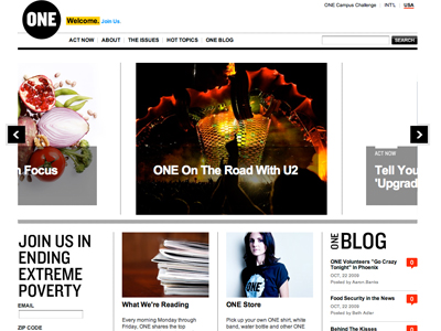
5. One.org | Blog in motion
One.org has done a nice job bringing the blog front and center, with a sliding image relating to recent blog posts front and center. The page is always in motion, and highlights the best of their blog.
