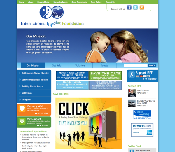
The homepage of your site is an important part of a new web design. Your homepage often contains different material than the interior pages. We like to think of it as a roadmap that guides the visitor to action.
For those who have the budget, A/B testing is when two home pages are designed and then rotated for effectiveness. Especially for those trying to create a specific action: sales, participation, donation, etc., this can be very effective.
So some questions that you may find helpful to consider, does the homepage:
- say who you are and what you do?
- specify who the audience is?
- clearly state your product or services
- guide visitors to specific action steps?
- express your identity visually?
- look professional, better than the other sites?
- tell why you are different than the competition?
- have clear, intutive and persistent navigation?
- invite users to click through to other pages?
- allow for easy scanning, understanding at a glance?
- provide timely news or blog posts?
- show you are trustworthy?
- keep the visitor’s attention?
- allow users to add content, or interact?
- other social media feeds?
As you can see, it’s a challenge to get all these concepts packaged into something that is visually cohesive, uncluttered and moves the visitor to action. Plan to clean up and tidy your front page several times a year with relevant and visually engaging items.


